nac.today News Platform Project
Background
Context
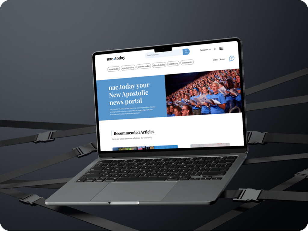
The official news platform of the New Apostolic Church. With branches in over 160 countries, this website serves a diverse, worldwide audience, providing access to news and updates from across the global church.
The New Apostolic Church had a website that struggled with poor navigation, content discoverability issues, and a lack of visual appeal, there were no images to enhance engagement. Given the church’s long history, the UI felt outdated and no longer met the needs of a modern, global audience.
My Role
I was brought on to modernize the website, giving it a fresh, updated look while completely overhauling the user experience. My focus was on:
- Improving navigation: Making it seamless and intuitive for users to find what they need.
- Enhancing content discoverability – Ensuring news and updates are easily accessible.
- Refreshing the UI – Bringing in a clean, modern design that aligns with the church’s global presence.
The goal was to create an experience that feels current, engaging, and user-friendly for the diverse audience across 160+ countries.
Impact of the design
The redesign had a significant impact after launch. Retention rates increased, and user feedback was overwhelmingly positive, with more visitors engaging with the platform than before. To measure the response, we sent out an email survey to subscribed readers of nac.today, within just one hour, we received over 300 responses, highlighting the strong interest and appreciation for the new platform.
Research
Research Goal
The primary objective of our research was to understand the needs and priorities of the website’s global users. We aimed to identify what features mattered most to them, including language options, video and audio content, text-to-speech functionality, and overall usability improvements. By gathering these insights, we could design a website that truly served its diverse audience.
Research Methodologies
The UX researcher and I conducted user interviews to collect firsthand feedback. Due to language barriers, some interviews were outsourced to native speakers, ensuring inclusivity and accurate insights.
Additionally, we performed competitive analysis of modern news websites, studying their strengths to inform our design decisions. This combination of user research and industry benchmarking helped us create a more engaging and accessible experience for the website’s global audience.

Key insights from research
The UX researcher and I conducted user interviews to collect firsthand feedback. Due to language barriers, some interviews were outsourced to native speakers, ensuring inclusivity and accurate insights.
Additionally, we performed competitive analysis of modern news websites, studying their strengths to inform ouKey insights from researchr design decisions. This combination of user research and industry benchmarking helped us create a more engaging and accessible experience for the website’s global audience.
I was brought on to modernize the website, giving it a fresh, updated look while completely overhauling the user experience. My focus was on:
- Users wanted more images, videos, and audio to make content more engaging and accessible.
- Users wanted recommended articles and a recently viewed articles section to easily continue where they left off
- Since the website serves a global audience, users emphasized the importance of multiple language options to improve accessibility.
- Many requested articles in series, allowing them to follow a sequence of related content
- Users wanted the ability to switch between light and dark themes for better readability in different lighting conditions
- Users struggled with finding content quickly, so they requested: _Easy-to-see search button _Sticky navigation bar for effortless browsing
Website Design
Lo-fidelity
I determined the order of flow and got to work building out the low fidelity wireframes.

Usability testing
We tested the low-fidelity prototypes with both users and stakeholders to align on key features.
Due to the website’s large global audience, the usability testing process took time, and with the help of the UX researcher, the feedback we gathered was invaluable. It provided clear insights into user needs, allowing us to refine the experience effectively and ensure a design that truly resonated with the audience
I also gathered valuable feedback from the CEO, who also conducted testing with potential users and collected feature requests.

Jobs to be done
Coming out of usability testing, stakeholder meetings, and feedback from the CEO, I was able to narrow down the key areas for improvement.
At this point, there was a strong emphasis on the search functionality and navigation as top priorities. The need for multiple language options was reinforced, ensuring accessibility for the global audience.
Additionally, some usability testers suggested a color-coded navigation system to help users quickly identify the origin of articles or news—a brilliant idea. However, we had to carefully select colors that were neutral, culturally inclusive, and carried appropriate visual meaning across different countries.
High Fidelity Design
The CEO wanted me to create three or more design variations to explore different styles, layouts, and functionalities, merging the strongest aspects into a final, refined design that incorporates the best of all versions.
With the high-fidelity designs now ready, I refined the layout, incorporated carefully selected colors, and defined typography. The requested features from the initial usability testing have been implemented, ensuring that the design aligns with user needs. Now, it’s time for another round of testing to validate the improvements, gather further insights, and fine-tune the experience before development begins. Such a relief!


Usability Testing
The three variations were tested and at the end of the usability testing, some colors had to be adjusted to improve clarity and accessibility. Additional features were introduced, including a scrollytelling experience, NAC GPT for interactive engagement, an image gallery layout, and a news ticker to enhance content visibility. I also designed the mobile screens, ensuring a seamless experience for the large number of users accessing the website on their phones.

Challenges
Balancing Priorities
One of my biggest challenges was balancing user needs, stakeholder requirements, and the CEO’s vision. Each had different priorities, so I navigated constant iteration, clear communication, and strategic decision-making to align them while keeping the design user-centered.
Before and After
I wouldn’t call this a challenge, but I do wish I had a “before” version of the website to compare the flow and design with the updated version for this case study. It would have helped showcase the transformation more effectively.