Improving the discovery experience on ContigoU

Project Overview
My role: UI/UX Designer
Platform: ContigoU, a health tech platform connecting users with rehab and nursing facilities
Tool: Figma
INTRODUCTION
When finding care feels harder than it should
ContigoU is a health tech platform that helps families find and book skilled rehab and nursing facilities. The people using this platform are not casually browsing , they are often stressed, emotionally stretched, and making urgent decisions on behalf of a parent, spouse, or themselves.
The founder built the platform with the right intention but was dissatisfied with the output from the original agency. She reached out to me to take a fresh look and redesign the experience from the ground up.
What I found was a platform that asked too much of its users , scattered information, confusing navigation, broken data displays, and no clear path from landing on the site to understanding what a facility actually offered. For anyone in a calm state of mind, it would be frustrating. For someone in crisis, it would be a wall.
My guiding principle for every decision: people using this platform are already carrying enough. The interface should not add to that weight.
THE PROBLEM
A platform that didn’t match the urgency of its users
The original platform had a discovery experience that felt scattered and unguided from the moment a user landed on it. The issues weren’t about missing content, they were about how the existing content was organised, presented and communicated.
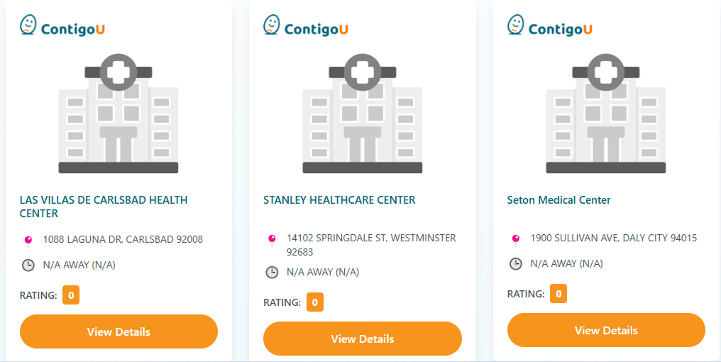
The Facility cards
On the facility cards, the information hierarchy made it hard to compare facilities at a glance. There were no service tags to tell users what type of care a facility offered, no insurance indicators, and no availability status, meaning a user had to click into every single facility just to understand the basics. The buttons used were heavy and visually dominant, pulling attention away from the content that actually mattere
The browse page
On the browse page, the filtering system was split across two locations simultaneously, a full sidebar with six filter categories on the left, and a separate filter bar at the top of the results. Rating appeared in both places with no clear hierarchy between them. A user trying to narrow down results had no single, obvious place to start, and no confidence that the filters they set were actually working together.

The facility details page
On the facility detail page, all information was broken into five separate tabs — Overview, Services & Specialties, Staff & Credentials, Reviews, and FAQ. For someone trying to evaluate a facility for a loved one, this meant clicking through multiple screens just to piece together a complete picture. Nothing was visible at a glance. The page demanded effort at exactly the moment users needed ease.

Beyond the core pages, the navbar had too many competing visual elements fighting for attention, the footer was nearly empty offering almost no useful links, and there was no blog or resource section — leaving users with nowhere to go when they needed guidance before they were ready to book.
RESEARCH & PROCESS
Learning from platforms that do discovery well
Before designing anything, I studied how established booking platforms structure their discovery experience. Airbnb was my primary benchmark — not because it is a healthcare platform, but because it handles a similar challenge: helping users make high-stakes decisions about unfamiliar places, with confidence, and without friction.
Key principles I identified and applied to ContigoU:
- Surface the most important information on the card level so users can compare without clicking
- Consolidate filtering into a single, familiar interaction pattern rather than spreading it across the page
- Replace tab-based detail pages with a single scroll so information is always visible and never hidden
- Use trust signals (verified badges, real photos, review counts) to build confidence before a user commits
- Let the interface feel calm and organised, especially when the user might not b
I also reviewed Caring.com, one of the closest equivalents to ContigoU, to understand how leading health platforms handle the emotional dimension of care search. Their use of family stories, advisor support, and transparent information hierarchy informed the warmer, more human direction I took with ContigoU.
SOLUTION: PART 1
Facility cards: making every card count at a glance
The facility cards were the first thing users saw on the homepage. The original cards used generic hospital illustrations and provided almost no scannable information, forcing users to click into every facility just to understand what it offered. I redesigned them to surface the right information upfront.
| Before | After |
|---|---|
|
Generic hospital illustration, no emotional connection |
Real facility photograph , immediate visual trust
|
|
ALL CAPS facility name, cold and hard to scan
|
Sentence case name, warmer and more readable
|
|
No insurance information visible
|
Insurance accepted shown on the card
|
|
No bed availability indicator |
‘Beds Available’, urgent and reassuring |
|
Heavy filled location dot competing with content |
‘Beds Available’, urgent and reassuring |
Cards had no reliable scannable information, giving users no way to compare facilities without clicking into each one.

Cards now lead with a verified badge, service tags, insurance information and bed availability, everything a user needs to decide, visible at a glance.

I redesigned the facility cards to surface the right information upfront, so users can compare and decide without clicking into every listing.
SOLUTION: PART 2
Browse page: one filter system, one source of truth
The original browse page had two competing filter systems running simultaneously — a full sidebar with six filter categories on the left, and a separate filter bar at the top of the results. Rating appeared in both places with no clear hierarchy between them. Users had no single obvious place to start filtering, and no confidence that both systems were working together.
This is not just a visual issue, it is a logic problem. Two competing systems with overlapping controls create confusion that erodes trust in the results.
| Before | After |
|---|---|
|
Full sidebar with 6 filter categories taking up left column |
Single ‘Filter’ button, one place, one interaction |
|
Separate top filter bar with Recommended, Distance, Rating
|
‘Sort by’ and ‘Share’ cleanly grouped in one row |
|
Rating duplicated in both sidebar and top bar, conflicting logic |
No duplication, one unified system |
|
No result count shown to user |
‘Showing all 147 facilities’ — clear user orientation |
|
ALL CAPS names throughout , cold and hard to scan |
Sentence case names , warmer and more readable |
Two competing filter systems ran simultaneously, a full sidebar and a separate top bar — with Rating duplicated in both, leaving users with no clear place to start and no confidence in their results.

All filtering consolidated into a single button, a clean sort option, and a clear result count, one interaction, one source of truth

I collapsed two competing filter systems into a single, familiar interaction pattern, freeing the page to lead with results, not friction.
SOLUTION: PART 3
Facility detail page: from tab maze to single scroll
The facility detail page is where users make their final decision. It is the most emotionally significant page on the platform. The original version hid all the critical information behind five separate tabs, requiring multiple clicks just to understand what a facility offered.
I redesigned it as a single, continuous scroll page — the same pattern Airbnb uses for listings — putting everything the user needs in a logical, unhurried sequence.
| Before | After |
|---|---|
|
Facility name in massive ALL CAPS heading, cold and aggressive |
Sentence case name — warm and readable |
|
Content split across 5 separate tabs |
‘About this facility’ section with a human, narrative description |
|
No room types, amenities or activities visible without clicking |
Room types, amenities and activities all visible on the page |
|
No embedded map or location context |
Embedded map with full address |
Information was fragmented across five separate tabs, forcing users to click through multiple screens just to understand what a facility offered.


Everything lives on a single scroll, photos, facility story, room types, amenities, reviews, map and admission information ,nothing hidden, nothing missed.


I collapsed a fragmented tab-based detail page into a single, scroll-friendly experience that puts every piece of decision-making information within reach, no hunting, no clicking, no confusion.
SOLUTION: PART 4
Navbar and footer: clearing the clutter at the edges
The navbar had four competing visual elements fighting for attention — a logo with tagline, bullet-pointed navigation, a teal-filled ‘Partner with ContigoU’ button, an outline Login button, and a filled orange Sign Up button. The tagline beneath the logo duplicated what the hero headline already communicated.
I removed the logo tagline entirely, cleaned up the navigation to flat text links, and preserved the CTA hierarchy (Partner link, Login outline, Sign Up filled) but with calmer visual weights. The navbar now guides rather than competes.
The footer went from nearly empty (just Privacy Policy and Contact Us) to a complete four-column layout: brand tagline, Quick Links, full contact details with address, email and phone, and social media icons.
The navbar carried too many competing elements, a logo with a tagline that duplicated the hero headline, bullet-pointed navigation items, and multiple solid-colour buttons all fighting for attention at once
I removed the logo tagline, navigation simplified to clean flat links, and the button hierarchy calmed down so the page content could lead.

The footer was almost entirely empty, offering users nowhere to go beyond a privacy policy and a contact link.

The footer became a complete four-column layout, quick links, full contact details, social media, and the brand tagline placed where it actually belongs.

Blog page
The original platform had no blog. I proposed and designed one from scratch, because people searching for rehab or nursing care often don’t know what they’re looking for. They need information before they need a booking flow.
This addition shows strategic thinking beyond the brief , addressing the research phase of the user journey, not just the booking phase.

OUTCOME
A platform the founder was proud to show
This project is currently in development. The founder brought me in after being dissatisfied with the output from the previous agency — and after seeing the redesign, she was confident in moving forward with the new direction.
She identified that the redesigned experience would tackle the platform’s most pressing problem: users dropping off before completing their search. A clearer path, less friction, and information surfaced at the right moment , that is what keeps people moving. That is what this redesign was built to do.
People booking rehab or nursing care are often overwhelmed. A confusing layout isn’t just a UX inconvenience, it is an additional burden on someone already at capacity. Every decision I made was to remove that burden.
Once live, ContigoU will offer the first empathy-driven, trust-first discovery experience in its category.
Reflection
What I learned
This project deepened my belief that UX in healthcare is not just about usability, it is about emotional safety. The standard heuristics (clarity, efficiency, consistency) all still apply, but they carry a different weight when the person on the other side of the screen is scared.
It also taught me that sometimes the most important design decision is subtraction. Removing the tab system, removing the logo tagline, removing the sidebar filters, the most impactful changes were things I took away, not things I added.
Working on this project also reinforced something I now carry into every brief: when users are vulnerable, clarity is not just good UX, it is care