HealthCare.gov Homepage Redesign
Disclaimer
This project is a personal exploration, not an official redesign, and has no connection to HealthCare.gov or any U.S. government agency. I cannot access internal user data or business constraints that may have shaped the current design. This case study aims to grow my skills as a product designer, challenge my thinking, and propose thoughtful improvements based on public-facing information and user-centered design principles.
What is Healthcare.gov?
HealthCare.gov is the official health insurance marketplace for the United States, run by the federal government. It helps individuals and families explore their health coverage options, compare insurance plans, check eligibility for subsidies, and enroll in coverage under the Affordable Care Act (ACA). The platform is designed to make health insurance more accessible and affordable, especially for people who don’t get coverage through an employer or other programs.
Why this Redesign?
While studying Physiology at university, I often explored how public health systems function in different countries, particularly how people access care. During one of my assignments on health policy and insurance models, I came across HealthCare.gov, the U.S. government’s official platform for health insurance enrollment.
Curious about how a country like the United States supports its citizens digitally, I decided to explore the platform. But the deeper I went, the more I realized how overwhelming and confusing the experience could be, especially for someone navigating it for the first time.
Second, I chose this project to sharpen my skills while focusing on the area I care deeply about: healthcare. With a background in health sciences and a passion for improving people’s well-being, I’m especially drawn to designing solutions that make access to care easier, clearer, and more humane. This redesign allowed me to practice creating thoughtful, user-centered experiences in a space that directly impacts lives.
Goals and Motivation for the Redesign
- To create a more personalized and intuitive user experience, the goal was to design an interface that adapts to users’ needs, guides them with clarity, and makes navigating the home page approachable, supportive, and straightforward.
- Deepen my learning by critically evaluating existing design decisions and actively challenging myself to propose thoughtful, user-centered improvements that address real usability issues.
- Take full ownership of the end-to-end product design process by stepping into key roles, including User Researcher, UX Designer, and UI Designer, gaining hands-on experience across the entire design journey.
Homepage UX Audit: Key Insights from HealthCare.gov
To better understand the user experience, I conducted a detailed review of the HealthCare.gov homepage. I interacted with all major buttons and links and reviewed the page structure. This hands-on analysis revealed several usability challenges that informed the direction of my redesign.
Some of the insights I gathered:
01
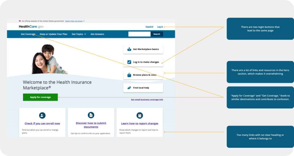
After closely re-exploring the homepage and interacting with all key buttons and links, I noticed that both the “Apply for Coverage” and “Get Coverage” buttons lead to nearly identical paths, prompting users to select their state and create an account.
02
Two “Log In” buttons direct users to the same destination, creating unnecessary redundancy and potential confusion.
03
The hero section is packed with helpful articles, announcements, and educational links, but they are scattered without structure. This results in cognitive overload, making it difficult for users to focus on the main action: getting insured.
04
Immediately after the hero section, the design lacks clear section headings or groupings, instead, users are met with clusters of unorganized links. There’s no guiding structure to differentiate content types (e.g., news, tools, resources), making it harder to scan or navigate purposefully.
05
The homepage does not tailor messaging for different user groups, e.g., new applicants, returning users
06
HealthCare.gov serves a wide range of users, many of whom may be first-time applicants or unfamiliar with healthcare terminology. Yet, despite the volume of critical content on the homepage, there is no live chat or real-time support feature available.
Painpoint
I imagined Christy, a 34-year-old single mother in Texas, juggling two jobs while raising her kids. She’s trying to find affordable health insurance for her family but feels overwhelmed by confusing terms, scattered links, and unclear steps. With limited time and no one to guide her, navigating HealthCare.gov becomes a stressful task.
Designing with users like Christy in mind helped me uncover key pain points that make the current experience frustrating and difficult to use.

Heuristic Analysis
To guide my evaluation and redesign, I referenced the Nielsen Norman Group’s 10 Usability Heuristics. This framework helped me annotate and categorize key usability issues throughout the existing HealthCare.gov homepage.
According to the 10 Usability Heuristics for User Interface Design
Flexibility & Efficiency of Use (Heuristic #7)
- The navigation bar lacks quick access to essential plans, which could improve user flow.
- The hero section overloads users with multiple links, articles, and resources, making it difficult for them to quickly find the most important actions.
Error Prevention (Heuristic #5)
- The abundance of buttons and links increases the likelihood of user errors
- Having multiple similar buttons like “Apply for Coverage” and “Get Coverage” could confuse users, leading them to click the wrong option or take unnecessary steps.
Match Between System & the Real World (Heuristic #2)
- Language and terminology used may not align with users’ real-world expectations or common usage. Phrases like “See Topics” and “Get Answers” may be unfamiliar or unclear to users, as they are not commonly used terms across most websites.
Below the Fold
Based on my analysis, the content further down the page consists mainly of links to various resources and articles. However, the current layout lacks clear prioritization, which could leave users feeling overwhelmed
Some of the insights I gathered:
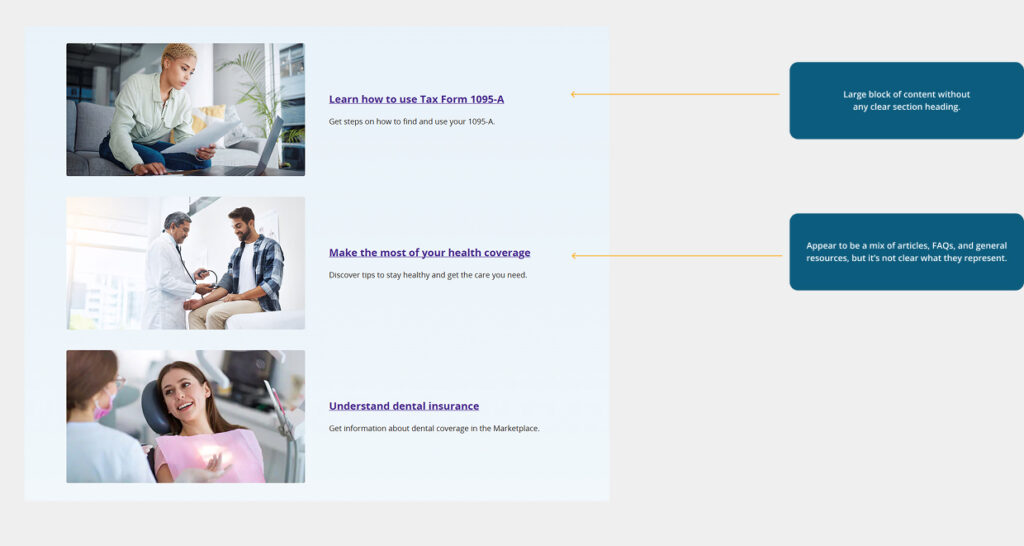
01
It lacks a clear section heading, which makes it difficult for users to understand the purpose of the content. It’s filled with numerous links that seem to be either blog posts or FAQs, but the lack of categorization leaves users uncertain about what they are engaging with.
02
This cluttered presentation results in unnecessary space being occupied without guiding the user through the content effectively.
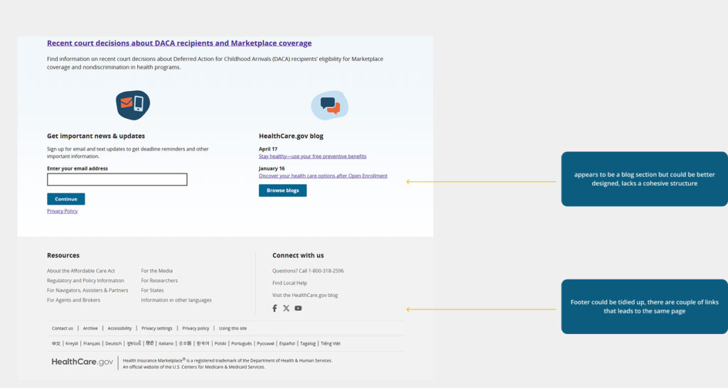
03
The blog section contains valuable, informative content that could help users better understand their healthcare options. However, it’s currently confined to a small, low-visibility area of the homepage. This design choice underplays its relevance and makes it easy to overlook.
04
The footer currently feels cluttered, with several links that lead to the same page, making it harder for users to quickly access key resources.
Competitive Analysis
I reviewed several other insurance websites to understand how they structure their homepages, with a particular focus on how they present key information in the hero section. I wanted to see how clearly and effectively they guide users toward important actions right from the start
Some of the websites are:
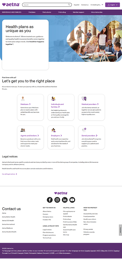
- Aetna: Clean layout with a focused hero section that directs users to key actions like understanding plan options.
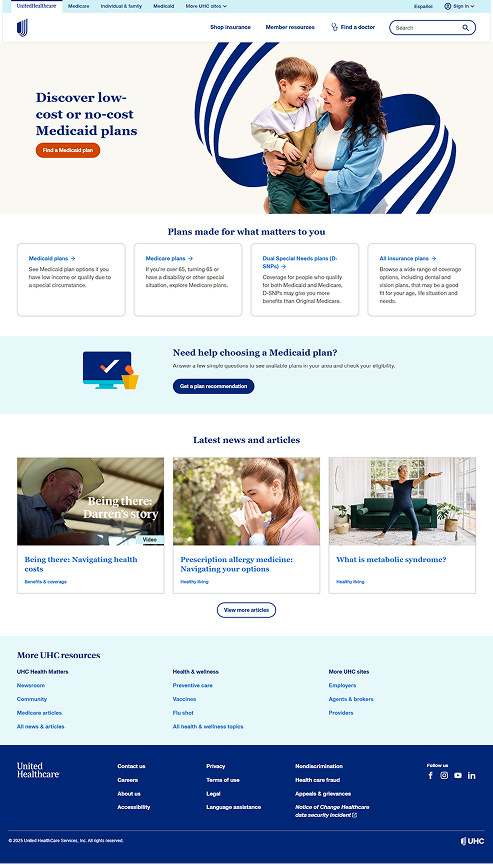
- UnitedHealthcare: Uses a simplified, user-friendly homepage with strong visual hierarchy and intuitive navigation, making it easy to start finding coverage.
Ideation and Design
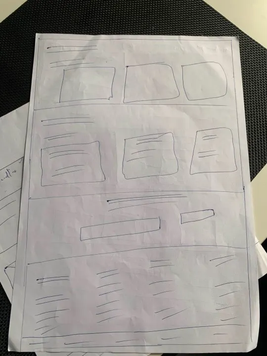
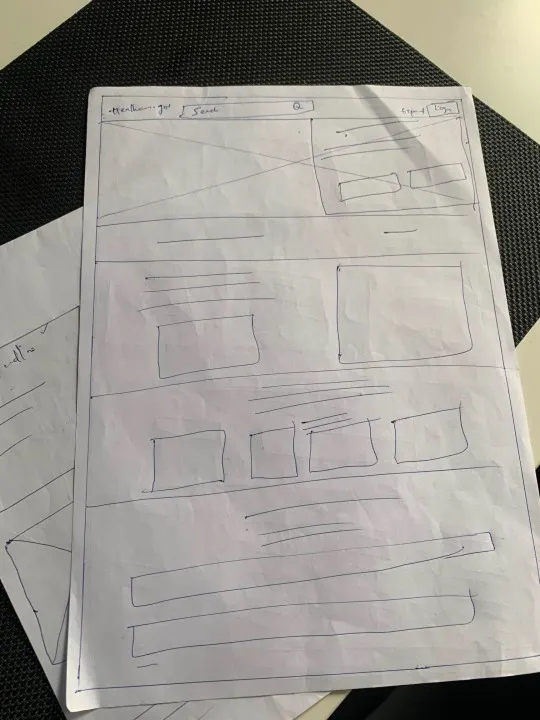
Paper Sketches
I transitioned to paper sketches to quickly explore and iterate on multiple layout ideas and design directions.
UX Suggestions and Redesign
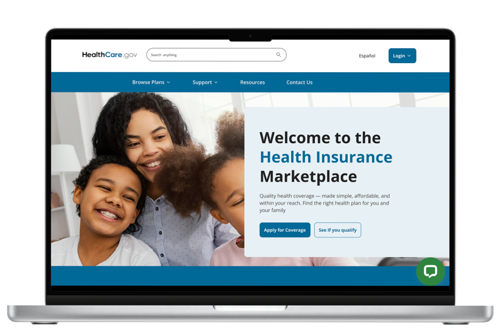
Below is the updated homepage I designed in Figma. I’ll walk you through the key changes and rationale behind each design decision.

Proposed solution
Below is the updated homepage I designed in Figma. I’ll walk you through the key changes and rationale behind each design decision.
| Problem | Solution |
|---|---|
|
Repetitive buttons, such as “Apply for Coverage” and “Get Coverage,” create confusion. Additionally, there are two separate login buttons — one for general login and another for making changes, both of which lead to similar pages.
|
I combined the “Apply for Coverage” and “Get Coverage” buttons into one clear CTA to eliminate duplication. I also replaced the two login buttons with a single login entry point, adding a dropdown menu that allows users to select between “Returning Member Login” and “New User Sign In”, making navigation more intuitive and streamlined. |
|
Too many links in the hero section lead to visual overload and make it difficult for users to focus on the most important actions. |
I streamlined the hero section by reducing the number of links and focusing on the key actions, such as “Apply for Coverage” “See if you qualify”. This allows users to quickly identify the most important steps and reduces the cognitive load, making the page more user-friendly and easier to navigate. |
|
Scattered links below the fold without section headings cause confusion and make it difficult for users to identify the content they’re looking for. |
I introduced clear section headings and organized the content into specific categories such as Blogs, FAQ, and Help Section. This categorization helps users easily locate relevant information and improves overall navigation and accessibility. |
|
Phrases like “See Topics” and “Get Answers” may be unfamiliar or unclear to users, as they are not commonly used terms across most websites |
I updated the navigation bar by replacing these terms with more familiar and user-friendly labels like “Resources” and “Support”. I also added a “Contact Us” button to make it easier for users to reach out for help or additional information. |
|
The website lacks live support or chat, making it harder for users to get immediate assistance. |
I added a live chat icon for real-time support, allowing users to easily reach out for help. Additionally, I included a “Find Plans” section just below the hero section to assist users in quickly navigating and discovering the plans they are eligible for, improving overall user experience and accessibility. |


Color Contrast Accesibility
I tested the color contrast on both the existing and redesigned homepages using the contrast ratio. Both versions meet the WCAG 2.0 and 2.1 standards for accessibility. This ensures that the text is readable against the background, enhancing overall usability and making the website more inclusive for all users.
Design Priorities and Constraints
I tested the color contrast on both the existing and redesigned homepages using the contrast ratio. Both versions meet the WCAG 2.0 and 2.1 standards for accessibility. This ensures that the text is readable against the background, enhancing overall usability and making the website more inclusive for all users.
Reflections and Lesson Learned
This project was a valuable learning experience. Beyond designing, I gained insight by exploring articles and Nielsen Norman’s principles. Although I felt a bit overwhelmed initially, I saw it as the right challenge to push my skills further.
Redesigning the homepage reminded me how central users are to every design decision, and how even small tweaks, like repositioning an element, can significantly improve usability. It showed me that growth as a designer is an ongoing journey, and every project is a chance to learn something new.